
Painting
Every shape carries a paint: which color, whether that color fills or strokes, how the stroke looks, and how the result composites onto what is below. This page covers the paint props shared by all shapes, the <Paint> override component, and how Group passes paint down to its subtree.
Fill vs stroke — style and color
style routes the color to the shape's fill or stroke paint. It defaults to "fill", except on Line, Polyline, and Points, which stroke by default:
<Circle cx={50} cy={100} radius={45} color="#3b82f6" />
<Circle
  cx={50}
  cy={100}
  radius={45}
  color="#3b82f6"
  style="stroke"
  strokeWidth={6}
/>
color accepts any CSS color string ("red", "#fff", "rgb(…)"), a packed 0xAARRGGBB number, an {r, g, b, a?} object, or an [r, g, b, a?] tuple. Omit it for a transparent (no-op) shape.
opacity (0–1) applies to the whole shape and is folded into the paint's color alpha:
{
  [0.25, 0.5, 0.75, 1].map((o) => (
    <Circle key={o} cx={55} cy={100} radius={34} color="#8b5cf6" opacity={o} />
  ));
}
Stroke attributes
Stroke-only props, ignored unless the shape draws a stroke:
| Prop | Values | Notes |
|---|---|---|
strokeWidth | number (px) | — |
strokeCap | "butt" | "round" | "square" | Endpoints of an open stroke |
strokeJoin | "miter" | "round" | "bevel" | Corners of a stroke |
strokeMiter | number | Miter limit for "miter" joins |
dash | number[] | [on, off, on, off, …], SVG dasharray rules |
dashOffset | number (px) | Phase offset into the dash pattern |
<Path
  path="M40 50 L320 50"
  color="#3b82f6"
  style="stroke"
  strokeWidth={6}
  dash={[16, 8]}
/>
<Path
  path="M40 50 L320 50"
  color="#3b82f6"
  style="stroke"
  strokeWidth={6}
  dash={[16, 8]}
  dashOffset={12}
/>
An odd-length dash array is repeated once to make it even (SVG stroke-dasharray semantics); an invalid pattern (empty, negative values, or a zero sum) is dropped and the stroke renders solid. A tiny dash with round caps (dash={[2, 10]} strokeCap="round") renders a dotted line.
fillRule
Path (and clip paths) choose how self-intersecting geometry fills: "nonzero" (default) or "even-odd". Two nested rectangles make the difference visible — nonzero fills over the inner rect, even-odd punches it out:
import { Path, Path2D } from "@scumble/react";

const nestedRects = (x: number) =>
  new Path2D().addRect(x, 40, 100, 100).addRect(x + 25, 65, 50, 50);

<Path path={nestedRects(60)} color="#f59e0b" />
<Path path={nestedRects(200)} color="#f59e0b" fillRule="even-odd" />
<Paint> — per-slot paint overrides
A shape has (at most) one fill paint and one stroke paint. Shaders placed directly under a shape target the fill slot; a <Paint style="stroke"> child overrides the stroke slot, and shaders nested inside it stroke instead of fill:
<Circle cx={180} cy={100} radius={70}>
  {/* fills the circle */}
  <LinearGradient start={vec(110, 30)} end={vec(250, 170)} colors={["#a855f7", "#ec4899"]} />
  {/* strokes it */}
  <Paint style="stroke" strokeWidth={8}>
    <SweepGradient
      c={vec(180, 100)}
      colors={["#ef4444", "#f59e0b", "#22c55e", "#3b82f6", "#ef4444"]}
    />
  </Paint>
</Circle>
<Paint> accepts color, strokeWidth, cap/join/miter, dash/dashOffset, blendMode, and opacity; values given here override the shape-level ones, omitted values fall back.
Multi-pass — several <Paint> children
While a shape keeps at most one fill + one stroke on the shared single-slot channel, declaring several <Paint> children of the same style — or any <Paint> with its own opacity — switches the shape to the multi-pass channel: the geometry draws once per paint, each pass with fully independent state (per-pass opacity/blendMode, stroke attributes, shaders, filters). The shape's own paint props become an implicit first pass; on this channel opacity and blendMode are per-pass, not shared slots.
{
  /* three concentric strokes — impossible on the single-slot channel */
}
<Circle cx={180} cy={100} radius={70}>
  <Paint style="stroke" color="#1e3a8a" strokeWidth={24} />
  <Paint style="stroke" color="#3b82f6" strokeWidth={12} />
  <Paint style="stroke" color="#93c5fd" strokeWidth={3} />
</Circle>;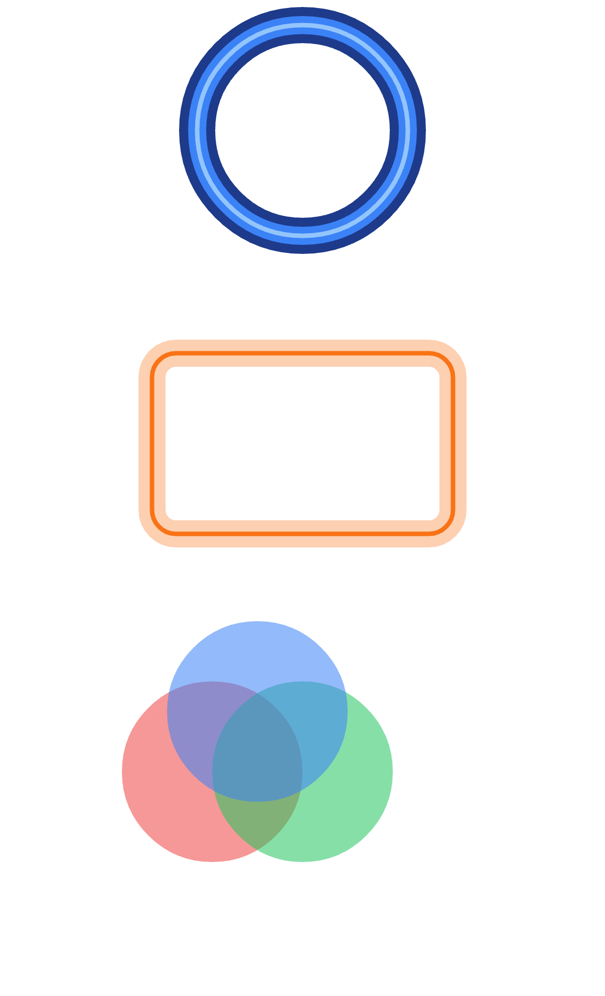
Paint inheritance from Group
A Group's paint attributes — color, style, opacity, the stroke attributes, and dash — apply to every descendant that does not set its own. opacity composes with exact group semantics: a group whose own opacity is below 1 composites its subtree through an offscreen layer first, so overlapping children fade as one unit (no double-blending where they overlap — RN-Skia/SVG semantics), while a leaf folds the value into its paint's alpha; a nested group can override for its own subtree:
<Group color="#3b82f6" opacity={0.7}>
  <Circle cx={50} cy={70} radius={35} />
  <Rect x={100} y={35} width={70} height={70} />
  <Group color="#ef4444">
    <Circle cx={210} cy={70} radius={35} />
    <Circle cx={290} cy={70} radius={35} color="#22c55e" />
  </Group>
</Group>
Geometry is never inherited — only paint. Gradients and <Paint> overrides placed directly under a group follow the same inheritance rules.
The same offscreen lane powers group-level filter effects — see Filters → the layer prop.
blendMode
blendMode sets how a shape composites onto what is below it — all 28 Skia modes, as kebab-case literals: src-over (the default), multiply, screen, overlay, darken, lighten, color-dodge, color-burn, hard-light, soft-light, difference, exclusion, plus, xor, the porter-duff family (src, dst, src-in, dst-in, src-out, dst-out, src-atop, dst-atop, dst-over, clear, modulate), and the separable HSL modes (hue, saturation, color, luminosity).
The mode applies to the shape's fill and stroke paints, and inherits from a Group like the other paint attributes:
{/* the amber circle multiplies over the blue one and the backdrop */}
<Circle cx={24} cy={42} radius={20} color="#2563eb" />
<Circle cx={52} cy={42} radius={20} color="#f59e0b" blendMode="multiply" />

{/* or per-subtree */}
<Group blendMode="multiply">
  <Rect x={30} y={30} width={120} height={100} color="#fde68a" />
  <Circle cx={150} cy={80} radius={50} color="#93c5fd" />
</Group>
Further reading
- PaintDemo.tsx and BlendDemo.tsx — cap/join/dash/fillRule and the blend-mode gallery, live
- Gradients — shader children as fill or stroke
- Filters — blur, shadows, and color filters per paint