
Shapes
The geometry components. Every shape inherits the full shared graphic props — color, style, opacity, blendMode, the stroke attributes, dash, transform, animate, and declarative shader/filter children — so the tables below list only the geometry each shape adds.
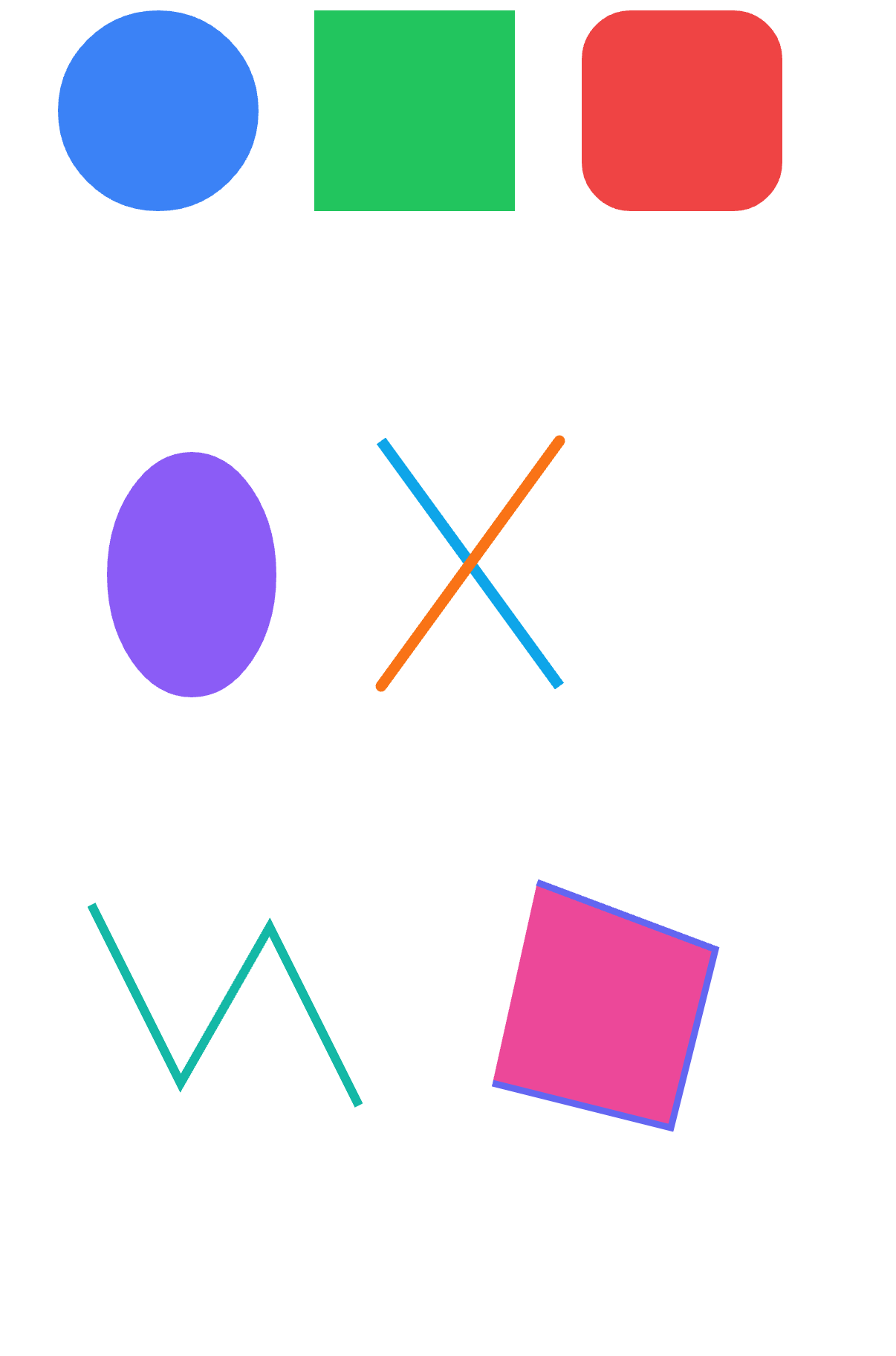
import {
  Circle,
  Ellipse,
  Line,
  Rect,
  RRect,
  Polyline,
  Polygon,
  Points,
  Path,
} from "@scumble/react";
<Circle>
A circle defined by its center and radius.
<Circle cx={50} cy={50} radius={30} color="#3b82f6" />Props
All shared graphic props, plus:
| Prop | Type | Default | Description |
|---|---|---|---|
cx | number | 0 | Center x (dp). |
cy | number | 0 | Center y (dp). |
radius | number | — | Radius (dp). Required. |
<Ellipse>
Axis-aligned ellipse defined by its center and two radii. A circle is the rx === ry special case (see <Circle>).
<Ellipse cx={100} cy={50} rx={80} ry={40} color="#3b82f6" />Props
All shared graphic props, plus:
| Prop | Type | Default | Description |
|---|---|---|---|
cx | number | 0 | Center x (dp). |
cy | number | 0 | Center y (dp). |
rx | number | — | Horizontal radius (dp). Required. |
ry | number | — | Vertical radius (dp). Required. |
<Line>
Straight line from (x1, y1) to (x2, y2). Always stroked — a line has no interior to fill — so style defaults to "stroke" (unlike the other shapes) and an explicit style="fill" is ignored natively.
<Line x1={0} y1={0} x2={100} y2={80} color="#3b82f6" strokeWidth={4} />Props
All shared graphic props, plus:
| Prop | Type | Default | Description |
|---|---|---|---|
x1 | number | 0 | Start point x (dp). |
y1 | number | 0 | Start point y (dp). |
x2 | number | 0 | End point x (dp). |
y2 | number | 0 | End point y (dp). |
<Rect>
Axis-aligned rectangle.
<Rect x={10} y={10} width={80} height={50} color="#ff0000" />
<Rect width={100} height={100} color="#000" style="stroke" strokeWidth={2} />
Props
All shared graphic props, plus:
| Prop | Type | Default | Description |
|---|---|---|---|
x | number | 0 | Left edge x (dp). |
y | number | 0 | Top edge y (dp). |
width | number | — | Width (dp). Required. |
height | number | — | Height (dp). Required. |
<RRect>
Rounded rectangle — a <Rect> with corner radii.
<RRect x={10} y={10} width={80} height={80} radii={16} color="red" />
<RRect width={100} height={100} radii={{ x: 10, y: 20 }} color="blue" />
// Only the top corners rounded (bottom-sheet / card shapes):
<RRect width={120} height={80} radii={[{ x: 16, y: 16 }, { x: 16, y: 16 }, { x: 0, y: 0 }, { x: 0, y: 0 }]} color="green" />
Props
All RectProps (and the shared graphic props), plus:
| Prop | Type | Default | Description |
|---|---|---|---|
radii | number | CornerRadius | CornerRadii | — | Corner radii: a number is uniform, {x, y} is uniform per-axis, and a 4-corner array is [top-left, top-right, bottom-right, bottom-left] (per corner {x, y}). Negative radii clamp to 0; radii too large for the rect are shrunk to fit at draw time. |
<Polyline>
Open polyline through the given vertices. Stroked by default (an open polyline has no interior); pass style="fill" to fill it as if closed.
<Polyline points="10,10 60,80 110,20 160,90" color="#3b82f6" strokeWidth={4} />Props
All shared graphic props, plus:
| Prop | Type | Default | Description |
|---|---|---|---|
points | string | Vec[] | — | The vertices, as an SVG points string ("0,0 20,30 50,10") or {x, y} pairs (e.g. from vec). Required. |
<Polygon>
Closed polygon through the given vertices — a closing segment from the last vertex back to the first is appended automatically. Filled by default, like the other closed shapes.
<Polygon points="50,0 100,90 0,90" color="#22c55e" />Props
All shared graphic props, plus:
| Prop | Type | Default | Description |
|---|---|---|---|
points | string | Vec[] | — | The vertices, as an SVG points string or {x, y} pairs — the shape is implicitly closed. Required. |
<Points>
A point set with Skia drawPoints semantics: dots, line segments, or an open polyline through the vertices. Stroked by default in every mode.
<Points points="10,10 60,80 110,20 160,90" color="#3b82f6" strokeWidth={8} />
<Points points="10,10 60,80 110,20 160,90" mode="lines" color="#f00" strokeWidth={2} />
Props
All shared graphic props, plus:
| Prop | Type | Default | Description |
|---|---|---|---|
points | string | Vec[] | — | The vertices, as an SVG points string or {x, y} pairs. Required. |
mode | "points" | "lines" | "polygon" | "points" | "points" draws a dot per vertex — the dot's diameter is strokeWidth and strokeCap defaults to "round" (a butt cap would leave a zero-length segment invisible); "lines" draws a segment per vertex pair; "polygon" strokes an open polyline through all vertices. |
<Path>
SVG path. path is an SVG d string (full command set M/L/H/V/C/S/Q/T/A/Z, relative and absolute, including concatenated arc flags) or a Path2D object built command-style — the two are interchangeable. A Path2D returned by Path2D.op() (lazy boolean composition) rides a separate channel; the native renderer evaluates the ops at draw time.
// from an SVG d string
<Path path="M10 10 L90 90 Z" color="#22c55e" />;

// from a Path2D (command-style)
const p = new Path2D().moveTo(10, 10).lineTo(90, 90).close();
<Path path={p} color="#22c55e" />;

// boolean composition, evaluated natively at render time
const mask = Path2D.op(circle, square, "difference");
<Path path={mask} color="#3b82f6" />;start/end trim the path — animating them (as pathStart/pathEnd, see Animation) is the classic draw-on effect.
Props
All shared graphic props, plus:
| Prop | Type | Default | Description |
|---|---|---|---|
path | string | Path2D | — | SVG path data string, or a Path2D object built command-style. Required. |
fillRule | "nonzero" | "even-odd" | — | Fill rule for the path. The parser also accepts the hyphenated "even-odd". |
start | number | 0 | Trim the start of the path — a normalized path-length fraction in [0, 1]. Applied to both fill and stroke; each contour of a multi-contour path is trimmed independently (Skia trim semantics). |
end | number | 1 | Trim the end of the path — a [0, 1] fraction. See start. |